Pronea – vizuálna identita


The keywords that were used in redesigning the logo beautifully guided the creation of Stylescapes – moodboards created from images and elements collected on the Internet, which help visualize future „touch & feel“ of the brand. No elements have yet been developed for this phase.
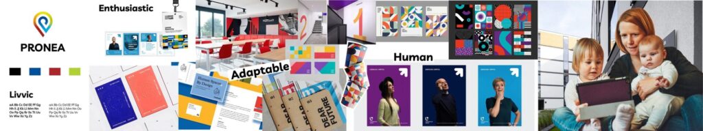
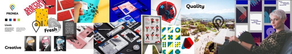
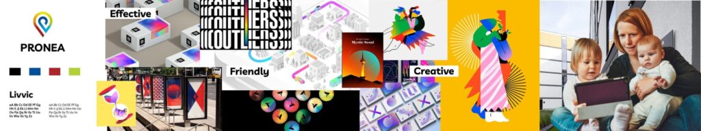
Based on joint conversations we narrowed down what the brand should look like, feel like, how it should communicate and what emotions it should evoke, who is the target audience and groups we want to reach. Subsequently, I singled out keywords that further guided the creative process: creative, professional, adaptable, innovative, proud, fresh, enthusiastic, quality, friendly, open, human and effective.
Based on them, three stylescapes were created, each showing a different design direction and focused on a different target group:
1 / Modular ecosystem – enthusiastic, adaptable, human
2 / With deeper meaning – creative, fresh, high quality
3 / Colorful future – efficient, friendly, creative
The winner was the Modular Ecosystem, with elements of communication of deeper significance.
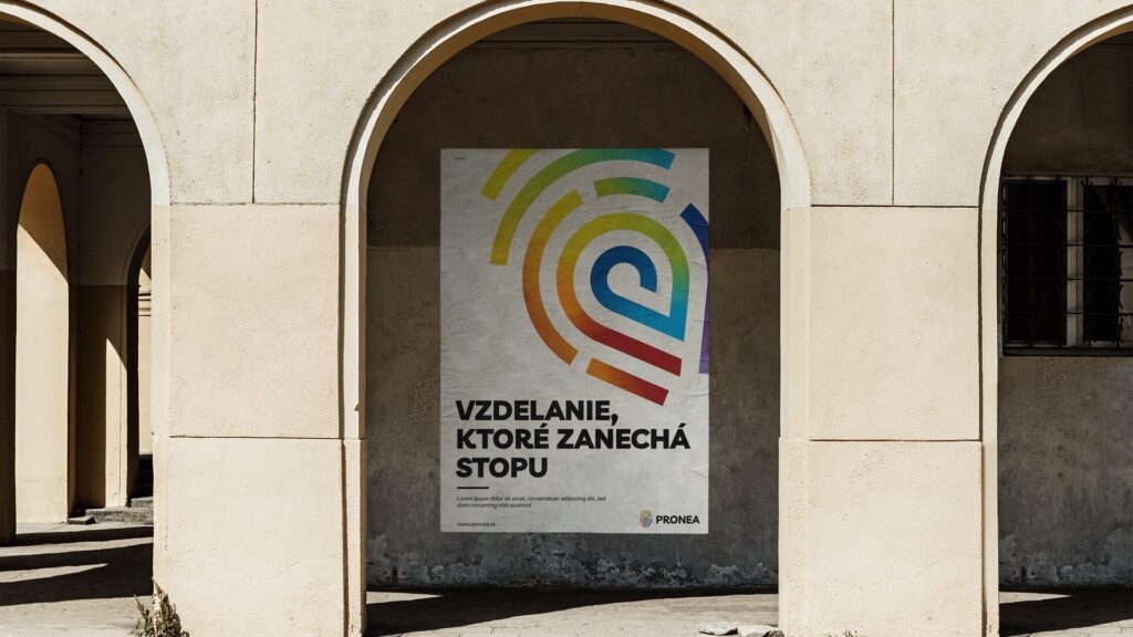
The main advantages of the Modular Ecosystem are: flexibility & adaptability, versatility, color, expressiveness, creativity and the human element. The starting point for the creation of identity was the logo and the possibilities it offers with its shape.
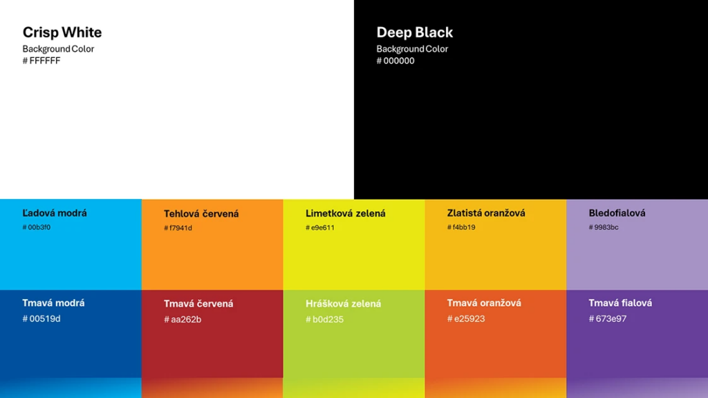
Since Pronea is created by five pillars: Academy, Campus, Hub, Smart Sport and Smart Music, each pillar of these pillars should be represented in the logo. This was achieved by color application via dynamic gradient. Each pillar has its own energy:
ACADEMY – analytical, calm and collected
CAMPUS – warm home away from home
HUB – greenfield for new ideas
SMART SPORT – dynamic and full of energy
SMART MUSIC – sophisticated and artsy self-expression field
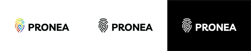
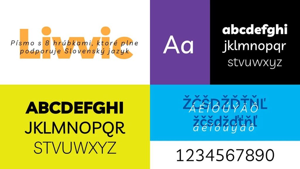
Livvic was (and still remains) a font of choice for Pronea selected by Andrej Kmeťo from Ideas & Innovations, the original creator of Pronea logo.
This font is nice and flexible with 8 different weights and full support of Slovak language.
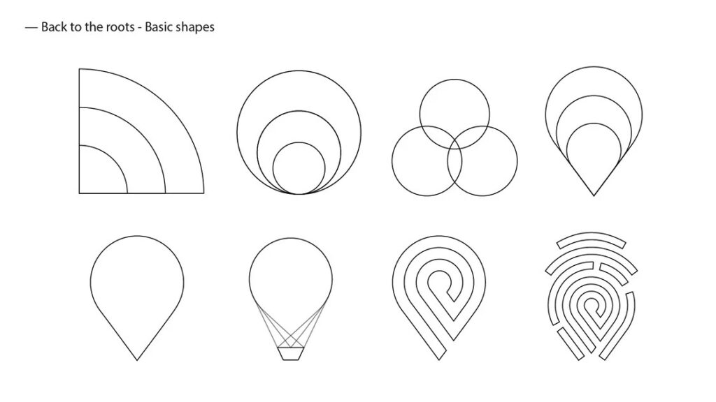
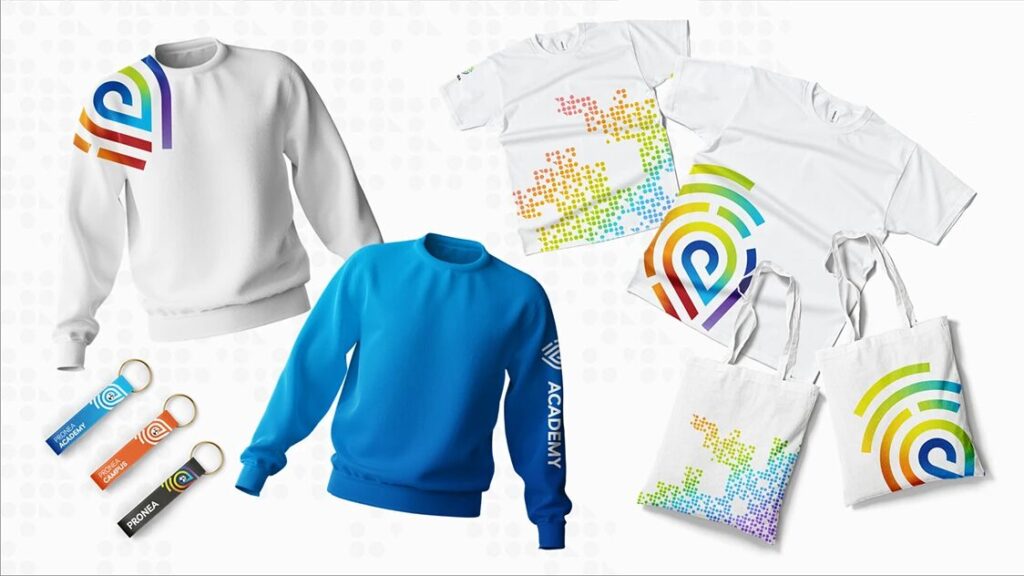
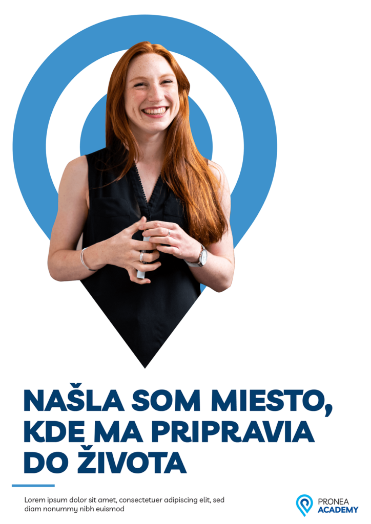
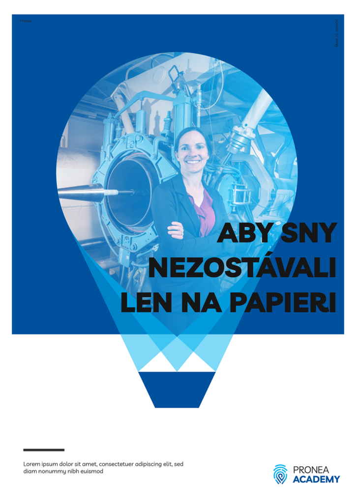
Logo shape offers many opportunities and inspiration for shape application. Combining these shapes in a modular pattern creates a beautiful and versatile background for various uses.
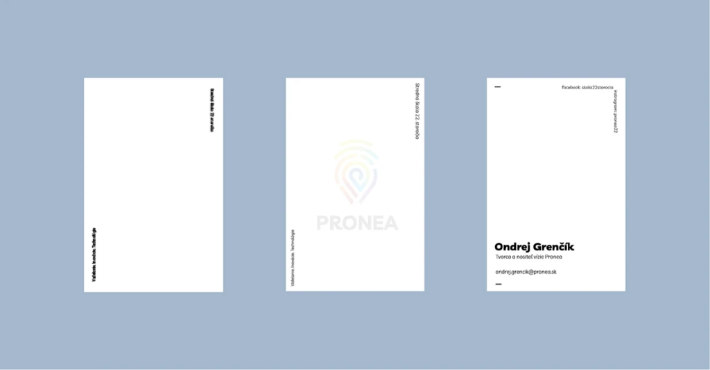
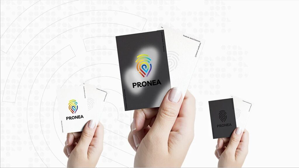
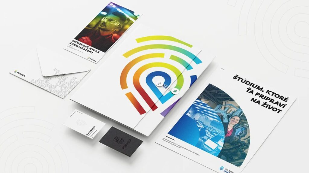
A special project requires special business cards. At first glance, I wanted them to engage and interact with their environment. Therefore, three proposals have been made:
Translucent – at the first glance they seemed like casual white business cards containing contact information only, but nothing is further from the truth. After they are exposed through the light, Pronea logo appears in the middle. It symbolizes every young person who comes to school as an unwritten sheet of paper and into whom Pronea imprints its education. In order for the student to reveal his hidden potential, it is necessary to show him the direction – as in order to reveal the logo you need a bit of guidance of the light.
Heat-sensitive – unique business cards that respond to the heat of a human hand. At first, the business card appears as pure black, but under the influence of heat, a hidden fully-colored logo is revealed. It symbolizes the imprint that each of our activities or deeds leaves in our surroundings.
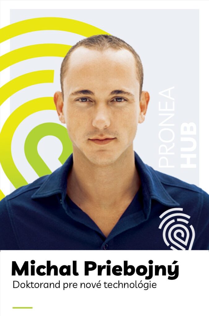
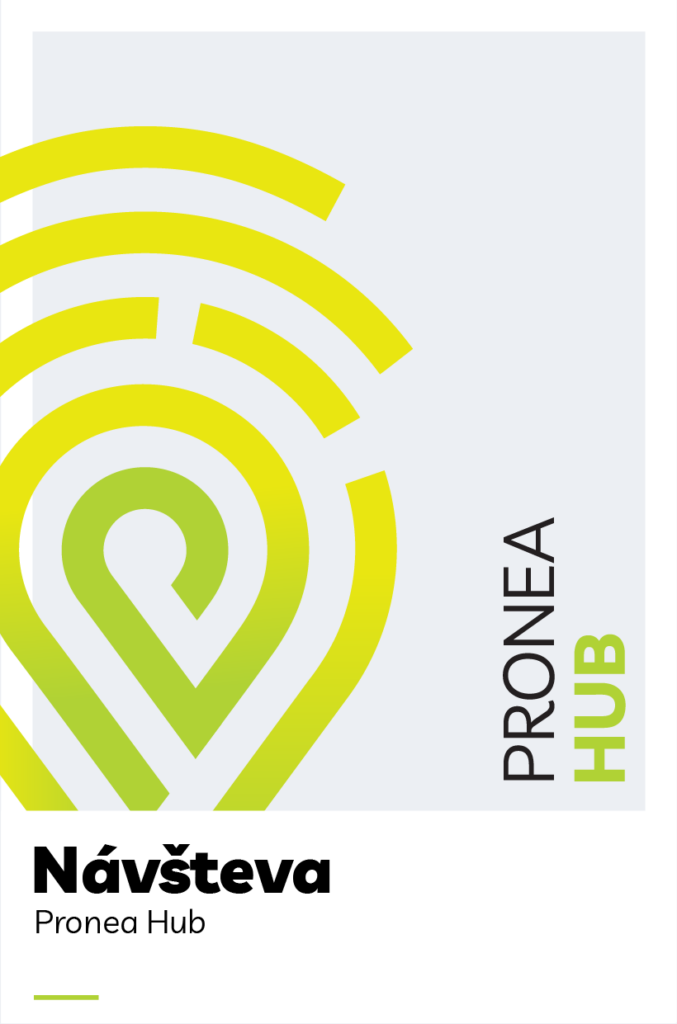
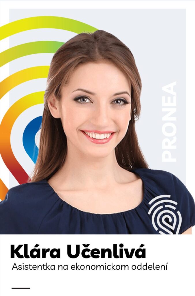
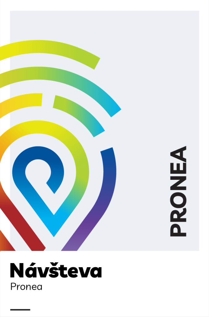
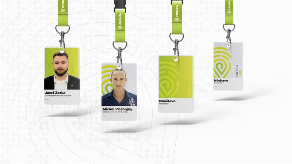
Employee cards were designed in three levels:
1 / Core team and permanent teachers – card with photo and full color background. The background color changes according to the affiliation to a particular pillar, in the case of the Core Team Pronea, the initials are used
2 / PhD students and part-time employees – gray background with color logo and photo – logo color changes depending on the pillar or Core team
3 / Visits – gray background with color logo, no photo.
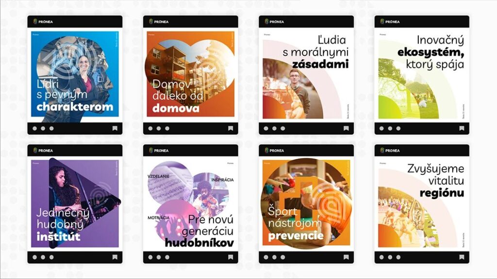
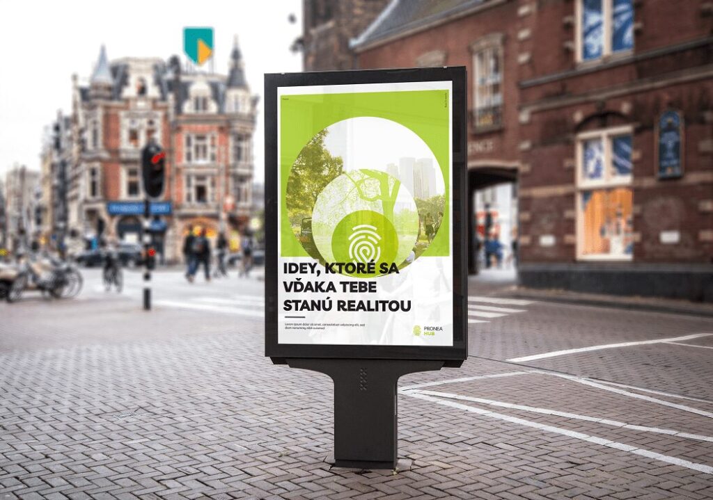
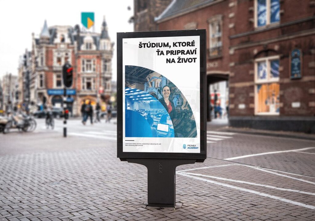
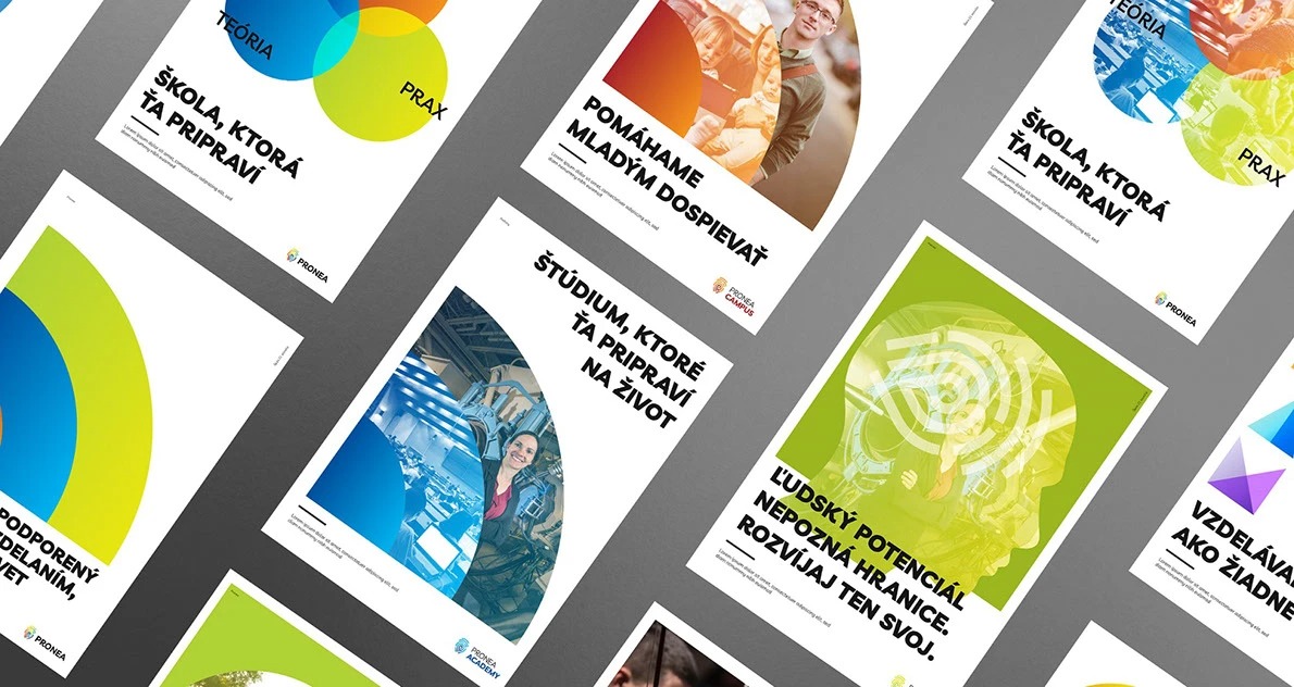
Visuals help to communicate what school brings to young people – growth, development and change. Therefore, three levels of visuals have been created, which are gradually supplemented and developed.
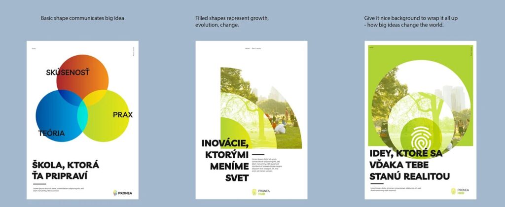
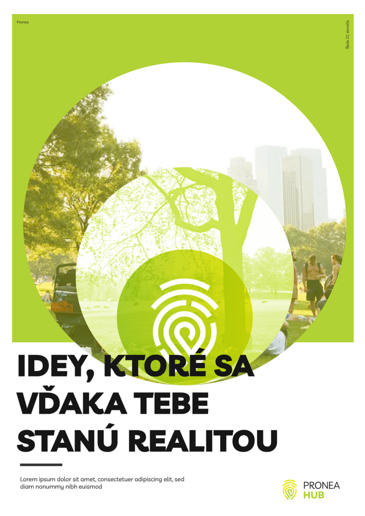
1 / Basic shapes – Strategic idea – represent big and more abstract ideas, vision or strategic direction. The abstractness of the shapes allows for a wide range of interpretations.
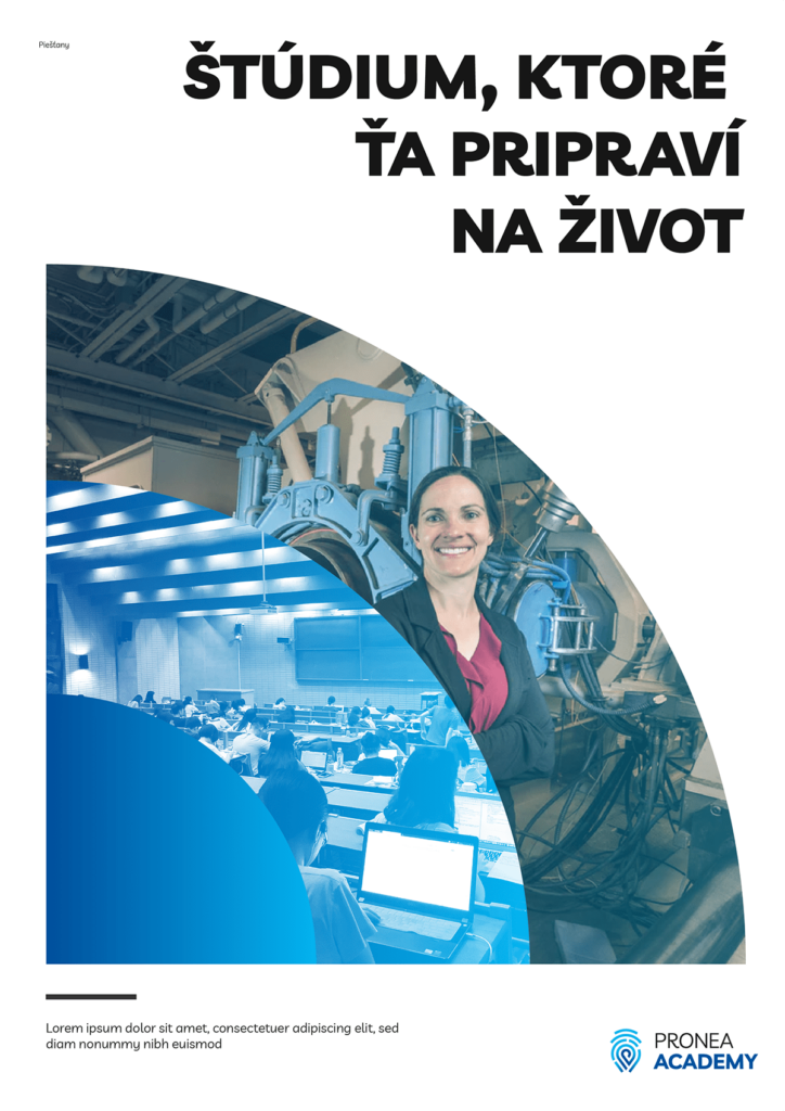
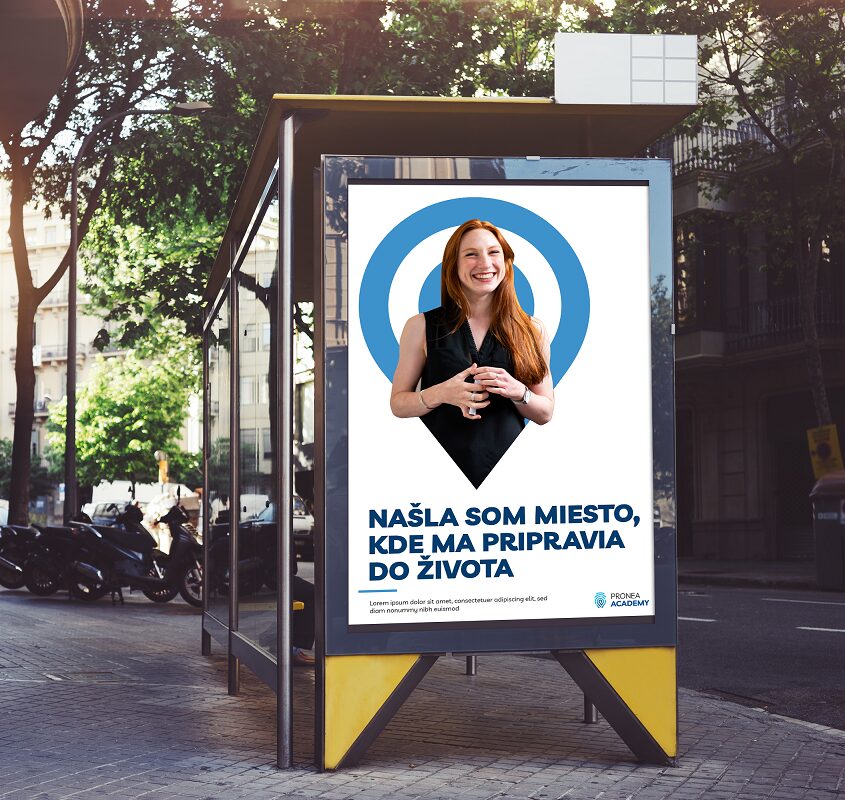
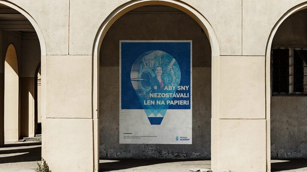
2 / Photographs – Development, process, growth, change – represent development and change. They show what the future might look like when they study at Pronea
3 / Combination of background and shapes – Tactical communication – everyday communication is born in strategic ideas (one-color abstract shape in the background) and shows the near future (photo), so it is appropriate to connect both versions for its visualization.
Now, let’s apply that to praxis!
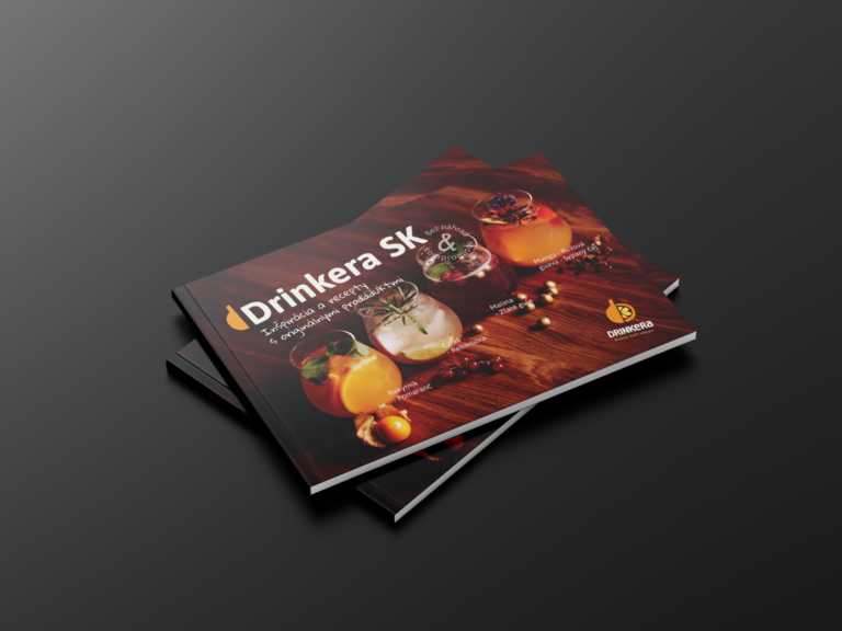
Slovak beverage producer Drinkera needed fresh catalogue design for their product offering including a range of tea, syrups, coffee and much more. The aim was to communicate fresh, modern, playful and inspiring beverages one can make with their products.

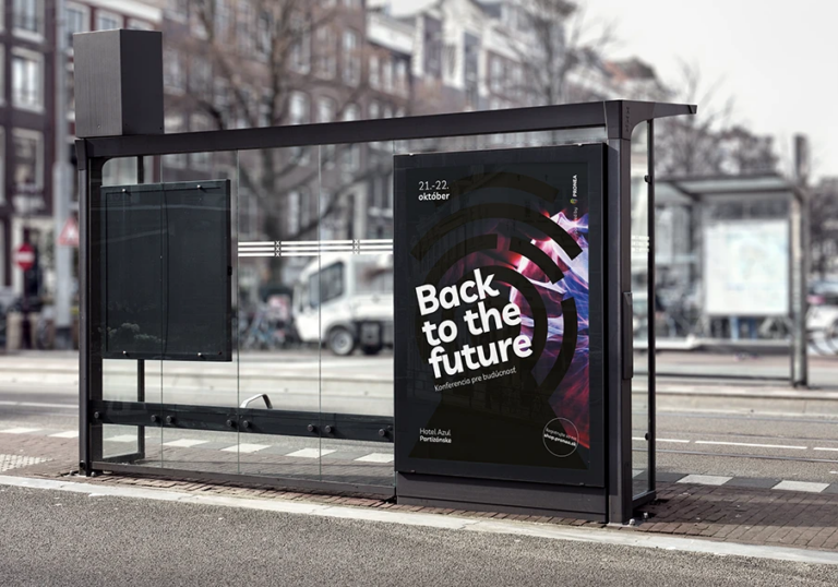
Back to the Future 2021 Autumn conference where Pronea collaborates with education and enterpreneurial leaders while connecting students with companies. The main idea was to create visual that represents the spark, the chill, the exciting idea new future may bring. Back to the Future 2023 Third year of an autumn conference where Pronea collaborates with…